The Making of a Country Road
There are paintings that come slowly, with meticulous effort — and then there are those that come like breath. With larger paintings, it can be somewhat in between the two extremes. A quiet vision emerged with this one, with tones and shadows quickly blocked in, forming shape and composition, but a lessening of pace as time proceeded, as a path gradually revealed by early morning light in the valley.
I began, as I often do, with a smaller sketch, focusing on values and looser shapes.
Layering Light with Pastel
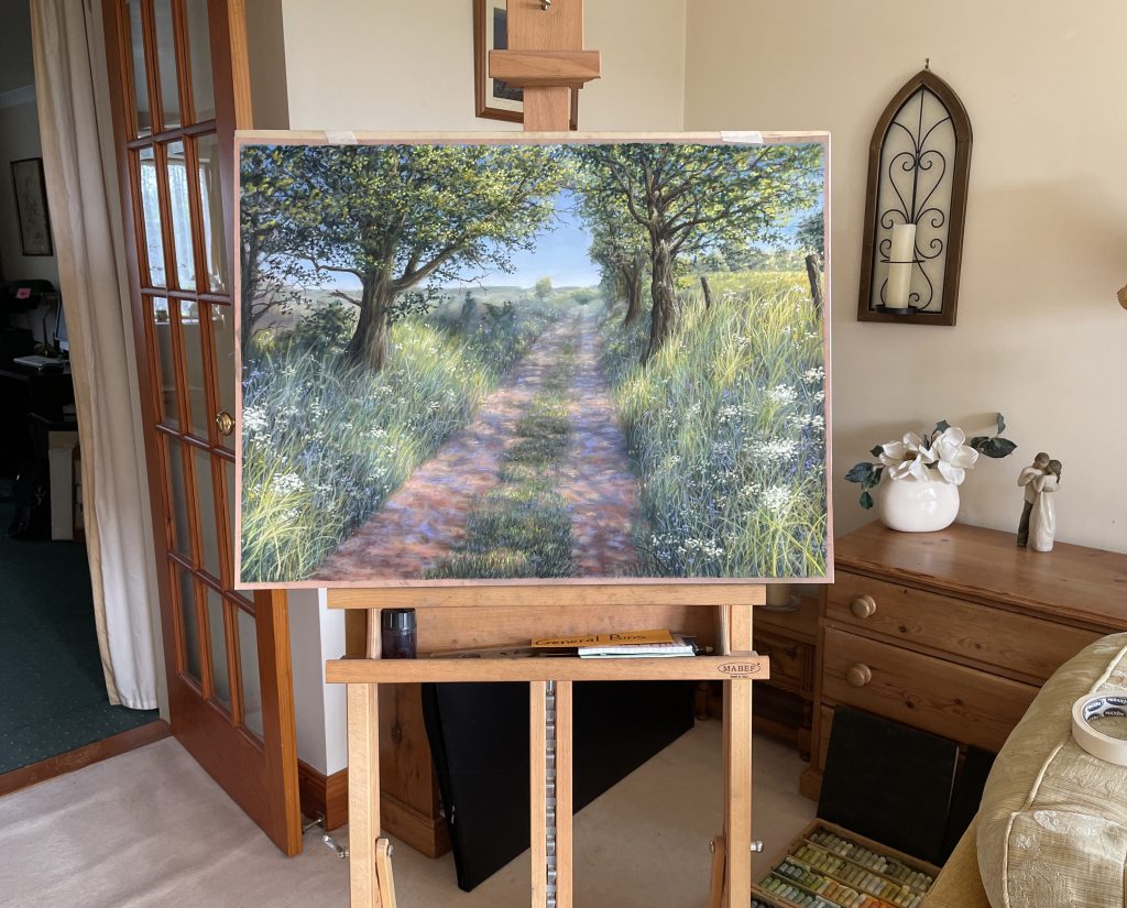
Working on toned Pastelmat card, I first laid in the sky — always the light source. With pastels, it’s important to establish your values early, because layering has limits. I chose a clear summer sky, not overly dramatic, but suggestive of warmth and clarity — a day when the air is gentle and the way is open.
The distant fields came next: soft bands in cooler tones, built up in layers of cool greys, muted teals, or paler earth-greens. I gently blurred these areas of the painting as time went on, to help them receded into the distance and create depth.
Then came the form of the trees and their foliage. The somewhat dark and stark forms of their trunks in the shadows needed a little lightening on the page, so as to allow the viewer to perceive better detail. I made the most of those areas where the sun glanced brightly off the boughs and leaves, leaning in to selective highlights and contrasts where possible.
Following that came the path and grassy verges. This part is always a favorite stage — the sweep of grasses and scattered wildflowers. I used broad side strokes to begin with, building up from blur to detail in such a way as to maintain depth and balance of texture. Later came the finer calligraphic marks for tall blades and stems, and the bloom of Queen Anne’s Lace.
Very important was the dappled light beneath the trees. Some of this effect could be established in the shadows and lights of the tall grasses, but its strongest impact would inevitably be upon the flatter surface of the path, where I leaned into strong contrasts of warm and cool tones.
Final Touches
Near the end, I stood back and realized something was missing. As can often happen with pastel in any detailed painting, the overall appealing softness of the medium seemed somewhat lost in the busyness of textures, especially in the path and grasses. This is often a mid-to-late stage in my painting – this was the time to be a little brutal, albeit selective, and use fingers or color shaper to blend in some excessive areas of texture and detail. Inevitably, some of the form and structure had to be worked back in on top of this blur, but more selectively. I often find that this stage really enhances the depth and credibility of a painting in pastel.
This study of the play of dappled light really reminds me of the poem by Gerard Manley Hopkins, “Glory be to God for Dappled Things!” There’s such a beautiful, lilting harmony God has formed in the glance of light and flickering shadows beneath a canopy of trees in a gentle breeze.

Leave a comment